Quality Monitoring: Profiling Reports as Fact Tables
The introduction described the vision: exit checks, entrance checks, line of sight, and accountability through measurement. This chapter describes the implementation.
The key insight is that the profiling reports generated by bytefreq and DataRadar — both the DQ mask frequency tables and the CP character profiling reports — are already structured as fact tables. They have dimensions (column name, mask or character, data feed identifier, timestamp) and measures (count, percentage, coverage). Stored consistently over time, they become a timeseries database of data quality telemetry that can be queried, aggregated, and visualised like any other operational metric.
The Operating Model
Before diving into the technical details, it is worth stepping back to see where quality monitoring fits in a data operating model.
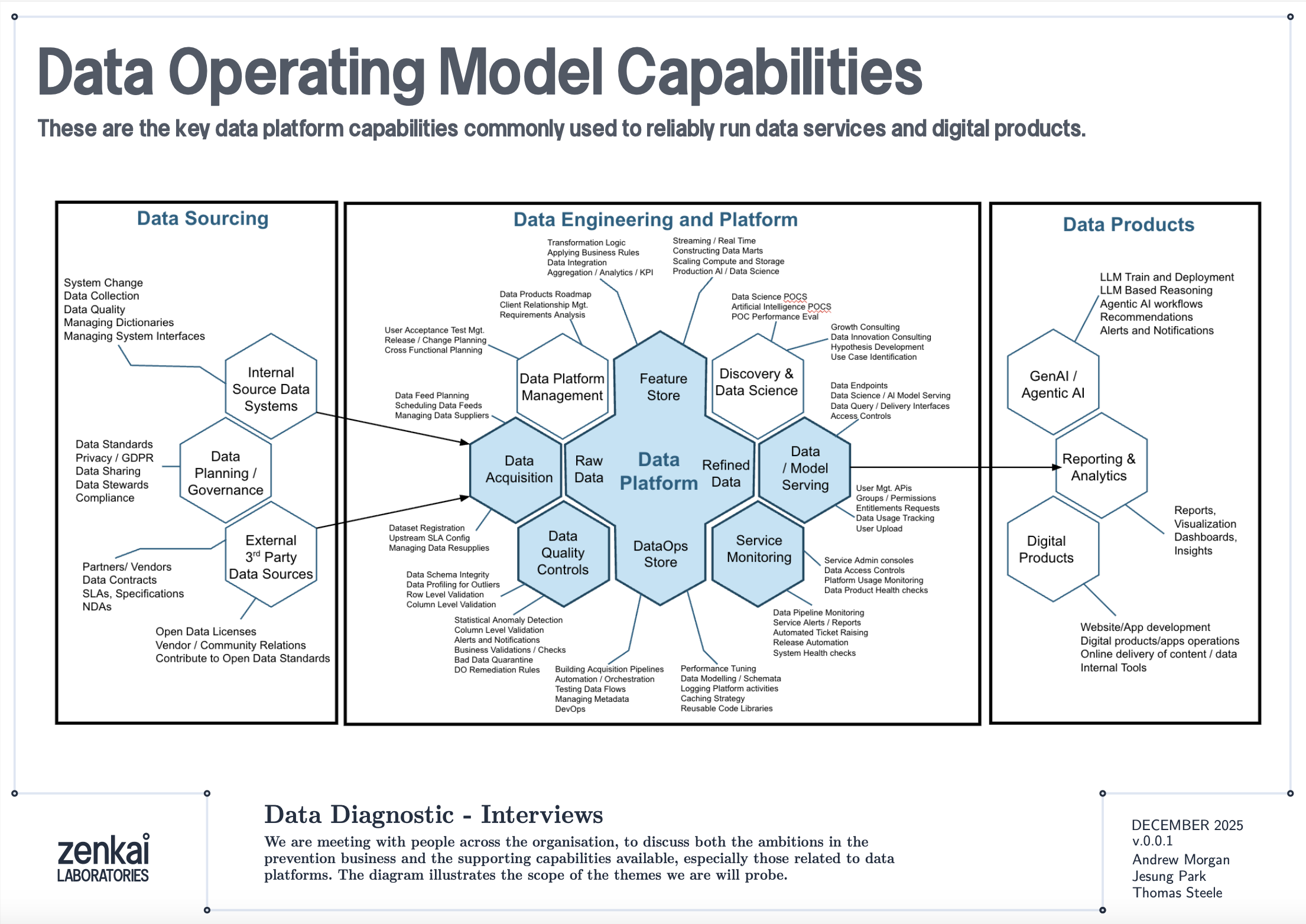
The diagram above shows a reference data operating model organised as a set of capabilities. Data Quality Discovery — the mask-based profiling described in this book — sits as a foundational capability that feeds into Data Quality Monitoring, which in turn feeds into Performance Reporting and Service Assurance. The profiling reports are the raw telemetry; the monitoring architecture is the plumbing that turns telemetry into KPIs; the service assurance layer is where those KPIs drive accountability.
This is not a technology architecture. It is an organisational capability map. The tools described in this book — bytefreq, DataRadar, DuckDB — are implementations. The capabilities they serve are what matter to a CDO or CTO.
Reports as Fact Tables
A standard DQ profile from bytefreq looks like this:
=== Column: postcode ===
Mask                Count   Example
A9 9A               8,412   SW1A 1AA
A99 9A              1,203   M60 1NW
A9A 9A                892   W1D 3QU
9                     312   N/A
In machine-readable mode (JSON output), this becomes a structured record:
{
  "column": "postcode",
  "masks": [
    {"mask": "A9 9A", "count": 8412, "example": "SW1A 1AA"},
    {"mask": "A99 9A", "count": 1203, "example": "M60 1NW"},
    {"mask": "A9A 9A", "count": 892, "example": "W1D 3QU"},
    {"mask": "9", "count": 312, "example": "N/A"}
  ],
  "total": 10819,
  "mask_cardinality": 4
}
Add a feed identifier and a timestamp, and you have a fact record:
{
  "feed": "council-planning-applications",
  "profiled_at": "2025-12-19T08:00:00Z",
  "column": "postcode",
  "masks": [...],
  "total": 10819,
  "mask_cardinality": 4,
  "coverage_top1": 0.777,
  "population_rate": 0.985
}
This is a dimensional fact table. The feed, timestamp, and column are the dimensions. The mask distribution, cardinality, coverage, and population rate are the measures. Store these records consistently and you have a timeseries.
The Directory Pattern
The simplest implementation is a directory of files, partitioned by date and feed:
quality-reports/
  2025-12-18/
    council-planning-applications.dq.ndjson
    council-planning-applications.cp.ndjson
    nhs-patient-demographics.dq.ndjson
    nhs-patient-demographics.cp.ndjson
  2025-12-19/
    council-planning-applications.dq.ndjson
    council-planning-applications.cp.ndjson
    nhs-patient-demographics.dq.ndjson
    nhs-patient-demographics.cp.ndjson
Each file contains the profiling report for one feed on one date. The DQ file contains mask frequency tables per column. The CP file contains character frequency tables. Both are NDJSON — one JSON object per column.
This is the same pool-and-glob pattern described in the DataRadar walkthrough chapter, applied to profiling reports rather than flat enhanced exports. The storage cost is negligible — profiling reports are small (kilobytes, not megabytes) because they contain aggregated frequencies, not individual records.
Querying the Timeseries
DuckDB's file glob turns this directory into a queryable timeseries with no ingestion pipeline:
-- Coverage trend for a specific column across all dates
SELECT
    profiled_at::DATE AS report_date,
    coverage_top1
FROM read_ndjson_auto('quality-reports/*/*.dq.ndjson', filename=true)
WHERE feed = 'council-planning-applications'
  AND column = 'postcode'
ORDER BY report_date;
-- Feeds where mask cardinality increased (new patterns appearing)
SELECT
    feed,
    column,
    profiled_at::DATE AS report_date,
    mask_cardinality
FROM read_ndjson_auto('quality-reports/*/*.dq.ndjson')
WHERE mask_cardinality > 10
ORDER BY feed, column, report_date;
-- Population rate drop detection (mandatory field becoming sparse)
WITH trends AS (
    SELECT
        feed,
        column,
        profiled_at::DATE AS report_date,
        population_rate,
        LAG(population_rate) OVER (
            PARTITION BY feed, column ORDER BY profiled_at
        ) AS prev_rate
    FROM read_ndjson_auto('quality-reports/*/*.dq.ndjson')
)
SELECT * FROM trends
WHERE prev_rate - population_rate > 0.05
ORDER BY report_date DESC;
These are the queries that power a quality dashboard. No database to maintain, no ingestion pipeline to build — just a directory of small JSON files and a query engine that reads them on demand.
Exit Checks and Entrance Checks
The monitoring architecture has two deployment points.
Exit Checks (Producer Side)
An exit check runs after a data pipeline produces its output, before the output is published to consumers. In a CI/CD pipeline, this is a post-build step:
#!/bin/bash
# exit-check.sh — run after data pipeline completes
FEED="council-planning-applications"
DATE=$(date +%Y-%m-%d)
OUTPUT_DIR="quality-reports/${DATE}"
mkdir -p "${OUTPUT_DIR}"

# Profile the output
cat pipeline-output.csv \
  | bytefreq -d ',' -f tabular \
  > "${OUTPUT_DIR}/${FEED}.dq.ndjson"

# Character profile
cat pipeline-output.csv \
  | bytefreq -d ',' -r CP \
  > "${OUTPUT_DIR}/${FEED}.cp.ndjson"

# Check for regressions against previous day
# (custom script that compares today's report with yesterday's)
python3 check-regressions.py \
  --today "${OUTPUT_DIR}/${FEED}.dq.ndjson" \
  --baseline "quality-reports/$(date -d yesterday +%Y-%m-%d)/${FEED}.dq.ndjson"
The exit check produces the quality report and optionally runs regression detection — comparing today's profile against yesterday's to flag significant changes. If the regression check fails (coverage dropped below threshold, new unexpected masks appeared, population rate fell), the pipeline can halt publication and alert the team.
Entrance Checks (Consumer Side)
An entrance check runs when a data feed is received, before it enters the consumer's pipeline:
#!/bin/bash
# entrance-check.sh — run when feed arrives
FEED="council-planning-applications"
DATE=$(date +%Y-%m-%d)
OUTPUT_DIR="quality-reports/${DATE}"
mkdir -p "${OUTPUT_DIR}"

# Profile the received data
cat received-feed.csv \
  | bytefreq -d ',' -E \
  > "${OUTPUT_DIR}/${FEED}.enhanced.ndjson"

cat received-feed.csv \
  | bytefreq -d ',' \
  > "${OUTPUT_DIR}/${FEED}.dq.ndjson"

# Compare against the producer's exit check report
# (if available via shared quality report exchange)
python3 compare-exit-entrance.py \
  --exit "producer-reports/${DATE}/${FEED}.dq.ndjson" \
  --entrance "${OUTPUT_DIR}/${FEED}.dq.ndjson"
When both exit and entrance checks are in place, discrepancies between them reveal problems in transit — encoding changes, truncation, field reordering, or lossy transformations that happened between the producer's output and the consumer's input.
KPIs and the Quality Dashboard
From the timeseries of profiling reports, several KPIs emerge naturally:
Coverage stability — Is the top-1 mask coverage for each column holding steady over time? A sudden drop means a new pattern has appeared in significant volume.
Mask cardinality trend — Is the number of distinct masks per column increasing? A gradual increase may indicate format drift. A sudden spike may indicate a data source change or a pipeline bug.
Population rate — What percentage of each field is populated? Track this daily. A mandatory field that drops from 99.5% to 80% is an early warning of an upstream collection problem.
New mask detection — Did any mask appear today that has never appeared before in this feed? New masks are the single most valuable alert in quality monitoring — they indicate structural change, which may be benign (a new valid format) or problematic (data corruption, source system change, encoding error).
Assertion pass rate — For columns where the rules engine runs (as described in the Assertion Rules Engine chapter), what percentage of values pass their assertions? An IBAN column where is_valid_iban drops from 98% to 85% deserves immediate investigation.
These KPIs are not exotic. They are the data quality equivalent of uptime, latency, and error rate in service monitoring. The difference is that most organisations do not measure them consistently — not because the measurement is hard, but because nobody set up the infrastructure to collect and store the reports. The directory-of-profiles pattern described here makes that infrastructure trivially simple.
Line of Sight: From Impact to Source
The monitoring architecture becomes genuinely powerful when connected to data lineage.
Consider a scenario: a downstream analytics team discovers that 5% of their geospatial analyses are failing because postcodes cannot be geocoded. The entrance check report for the feed shows that 5% of postcode values have the mask aaaa — alphabetic strings like null, none, test. The timeseries shows this started three weeks ago. The feed comes from Council X. Council X's exit check report confirms the same pattern — their collection system started accepting free-text in the postcode field after a software update.
With lineage metadata connecting the feed to its downstream consumers, the impact is quantifiable: 5% of records × N downstream analyses × cost per failed analysis = £Y. This is not a vague "your data is bad" complaint. It is a specific, evidenced, costed impact statement that can be presented to Council X's management.
This is the accountability loop that the introduction described. The timeseries provides the evidence. The lineage provides the traceability. The profiling reports provide the specificity. Together, they enable the conversation: "Your department's data collection change on this date caused this downstream impact costing this amount. Here is the evidence. How shall we fix it?"
Fit for the Journey
The traditional framing of data quality is fit for purpose — can the immediate consumer use the data for their intended task? This is necessary but insufficient.
Data in a modern government or enterprise rarely has one consumer. A dataset collected at a local council may flow through a regional aggregator, a central government data platform, a statistical publication pipeline, a machine learning feature store, and a public API before reaching its final consumers. At each stage, the data is read, interpreted, transformed, and forwarded. At each stage, structural assumptions are made. At each stage, quality issues can be introduced, amplified, or — if the right checks are in place — detected and addressed.
Fit for the journey means the data carries enough structural metadata to be understood and validated at every stage. The flat enhanced format (described in the Flat Enhanced Format chapter) provides this at the record level — each value carries its masks and assertions alongside the raw data. The profiling reports described in this chapter provide it at the feed level — each delivery carries a machine-readable quality certificate that downstream consumers can compare against their expectations.
When a data feed arrives with its profiling report, the consumer does not need to re-profile from scratch (though they may choose to, as an entrance check). They can read the report, compare it against the baseline, and make an informed decision: accept, reject, or accept with caveats. The report is a passport — a document that accompanies the data on its journey and records its structural state at each checkpoint.
Discovery Before Exploration
One final point about where this monitoring architecture sits in the broader data quality landscape.
Mask-based profiling is not a replacement for tools like Great Expectations, dbt tests, Pandas profiling, or Soda. Those tools are excellent at validating known expectations: is this column non-null? Does this value fall within a range? Does this distribution match the historical baseline? They are exploratory and validation tools that assume you already understand the structure of your data well enough to write meaningful tests.
Data Quality Discovery — the mask-based profiling step — comes before exploration. It answers the question that the exploratory tools cannot: what does this data actually look like? You cannot write a Great Expectations test for a column whose structure you have not yet discovered. You cannot explore what you cannot read.
The monitoring architecture described in this chapter adds the time dimension to that discovery. A single profile tells you what the data looks like today. A timeseries of profiles tells you how it is changing. The exit and entrance checks tell you where problems are being introduced. The KPIs tell you whether quality is improving or degrading. And the lineage integration tells you who is affected and what it costs.
These are the building blocks for assuring a data service — not just a file, but the entire flow of data through an organisation. The tools in the following chapters show how to implement each building block. The architecture is how they fit together.